
“Facts are stubborn things, but statistics are pliable.”
― Mark Twain
I’m a big proponent of tracking key metrics in your business. (For those unfamiliar with the term, a metric is simply a quantifiable measure that businesses use to track, monitor and assess the success or failure of various business processes). A large portion of my business is built on tracking and analyzing data. So having an abundance of relevant and reliable information is one of the cornerstones of most successful businesses.
However, we need to be careful that we are using good metrics, not bad ones. Okay, that sounds obvious, but how do we define “good” in this situation?
There are a few possible issues that could arise and things we want to avoid.
The first would be that the data shows spurious correlations, not true causation. There is an entire website is dedicated to finding correlations between completely unrelated items, such as Nicholas Cage films and the number of drownings that occur each year – along with margarine consumption and divorce rates:
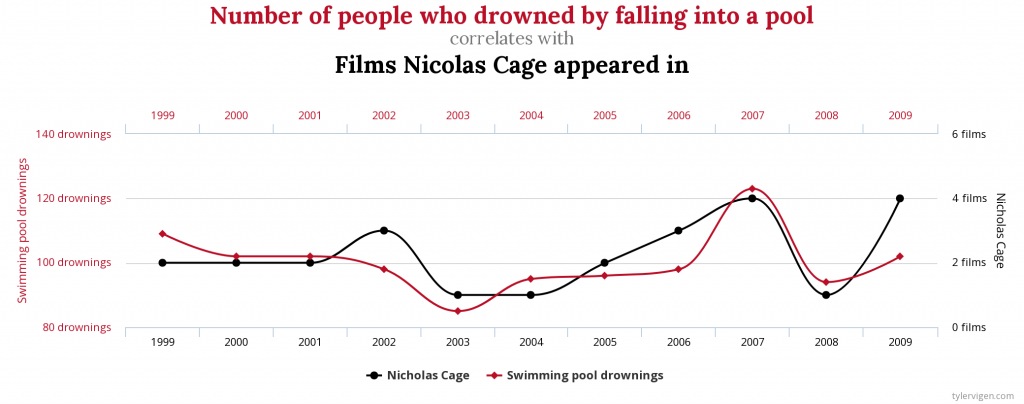
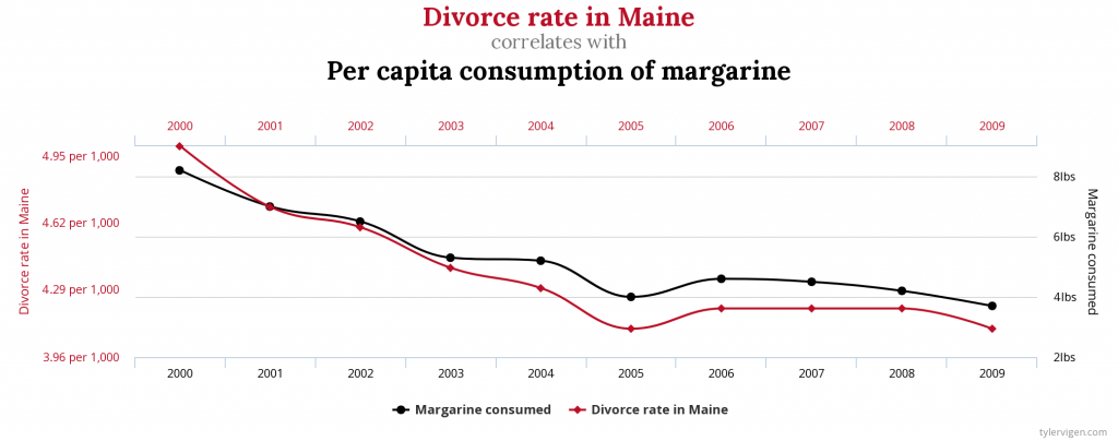
So the oft-quoted statistical maxim is certainly true: “Correlation does not necessarily prove causation.” And even when two data points are actually related, and a true correlation does exist, the information they show can still be misleading. They can often vastly oversimplify a situation and not tell the entire story.
One example I always think about was when a few years back railroad companies all started touting their RPU (revenue per unit). This was a simple calculation of dividing the amount of revenue a product generated by the number of freight cars used to ship the products – essentially how much they were able to charge per load. In theory this showed which railroads were negotiating aggressively with their customers and which ones were the most successful in achieving price increases. More revenue per carload has to mean higher prices, right?
The only problem? The longer the distance a product is shipped, the more a railroad (or any transportation company for that matter) charges. Which makes perfect sense: the shipping costs for moving something thousands of miles would naturally be more expensive than moving it fifty miles.
This is an oversimplification, but as an example let’s say there were two trainloads of cargo shipped. Freight car #1 was shipped 1,500 miles away, for which the railroad was paid $2,500. Freight car # 2 only had to be moved 100 miles away and the railroad was paid $500.
The railroad is charging THREE TIMES more per mile for Train 2 vs. Train 1. But based on the RPU calculation, Train 1 appears to be FIVE TIMES better than Train 2.
It’s a horrible measurement and often shows the exact opposite of what it’s intended to. But people still reference it and employees are graded on it. And because of that, business and investing decisions are made because of it.
And that’s only one example. I’ve had clients come in and we have had to rebuild their entire companies because the metrics they were using simply did not reflect the reality of their business. Revenue streams they believed to be extremely profitable turned out to be one of their weakest sectors, marketing they were doing was not leading to the sales they initially believed, and inefficiencies that seemed de minimis on the surface proved to be very costly.
These are hardly isolated phenomena. There are countless examples across all industries.
As we’ve shown, a measurement can still be “false” even if it is technically true. We need to make sure our metrics are accurate and are showing us what they are intended to.
Any accounting, business, or tax advice contained in this communication, including attachments and enclosures, is not intended as a thorough, in-depth analysis of specific issues, nor a substitute for a formal opinion, nor is it sufficient to avoid tax-related penalties


